本文的部分实现方案可在react-admin(test:test)进行体验。
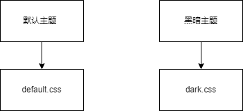
link 标签动态引入 黑暗主题模式 和 默认主题样式
通过在顶层的 link 标签进行动态引入多种不同主题的 CSS 样式文件,进行点击切换时删除之前的样式,添加选中的样式。
1
2
3
4
5
6
7
8
9
| const changeDark = (isDark) => {
document.getElementById("theme")?.remove();
const link = document.createElement("link");
link.id = "theme";
link.ref = "stylesheet";
link.href = isDark ? darkTheme : defaultTheme;
let head = document.getElementsByTagName("head")[0];
head.appendChild(link);
};
|
1
2
3
4
5
6
7
8
9
10
11
12
13
14
15
16
17
18
19
20
21
22
|
@import "antd/dist/antd.dark.css";
$dark-main-bg-color: #141414;
$dark-bg-color: #1f1f1f;
$dark-border-color: #414243;
body {
background-color: $dark-main-bg-color !important;
.mainLayout {
background-color: $dark-bg-color !important;
}
.layoutTree {
background-color: $dark-bg-color !important;
}
.tagContainer {
background-color: $dark-bg-color !important;
border-color: $dark-border-color !important;
}
}
|

两个 link 标签进行 href 引入,可以实现按需加载,但是每种主题模式需要单独维护一套 css 样式方案,新增主题或者维护主题都较为麻烦
色弱模式 和 灰色模式
这两种模式都可以直接通过设置 css 属性 filter 来实现,直接给全局的 body 添加即可
1
2
3
4
5
6
7
8
9
10
11
12
13
14
| const changeGrayOrColorWeak = () => {
const body = document.documentElement;
switch (grayOrColorWeak) {
case "gray":
body.setAttribute("style", "filter:grayscale(1)");
break;
case "colorWeak":
body.setAttribute("style", "filter:invert(80%)");
break;
default:
body.setAttribute("style", "");
break;
}
};
|
antd 的主题色设置
antd 对主题色 分为 primary-color warning-color success-color info-color,可以通过 antd 提供的 ConfigProvider.config 这个API来管理实现
1
2
3
4
5
6
7
8
9
10
11
| const changeThemeColor = () => {
ConfigProvider.config({
theme: {
primaryColor: "#1890ff",
errorColor: "#ff4d4f",
warningColor: "#faad14",
successColor: "#52c41a",
infoColor: "#1890ff",
},
});
};
|
useTheme
对主题色的设置 色弱模式 灰度模式的设置 都是对主题这一逻辑的管理,公共逻辑的管理,选择将其封装为一个 hook,所有的主题逻辑都由这套 hook 管理,控制的其余变量交给指定的 store 来维护即可
1
2
3
4
5
6
7
8
9
10
11
12
13
14
15
16
17
18
19
20
21
22
23
24
25
26
27
28
29
30
31
32
33
34
35
36
37
38
39
40
41
42
43
44
45
| import { ConfigProvider } from "antd";
import { useCallback, useEffect } from "react";
import { useAppSelector } from "store/types";
import darkTheme from "../style/dark.scss?inline";
import defaultTheme from "../style/default.scss?inline";
export const useTheme = () => {
const { grayOrColorWeak, isDark, grayColor, colorWeak, themeColor } =
useAppSelector((state) => state.theme);
const changeGrayOrColorWeak = useCallback(() => {
const body = document.documentElement;
switch (grayOrColorWeak) {
case "gray":
body.setAttribute("style", `filter:grayscale(${grayColor})`);
break;
case "colorWeak":
body.setAttribute("style", `filter:invert(${colorWeak})`);
break;
default:
body.setAttribute("style", "");
break;
}
}, [grayOrColorWeak, grayColor, colorWeak]);
const changeDark = useCallback(() => {
document.getElementById("theme")?.remove();
const style = document.createElement("style");
style.id = "theme";
style.innerHTML = isDark ? darkTheme : defaultTheme;
let head = document.getElementsByTagName("head")[0];
head.appendChild(style);
}, [isDark]);
const changeThemeColor = useCallback(() => {
ConfigProvider.config({
theme: themeColor,
});
}, [themeColor]);
useEffect(() => {
changeDark();
}, [isDark, changeDark]);
useEffect(() => {
changeGrayOrColorWeak();
}, [grayOrColorWeak, changeGrayOrColorWeak]);
useEffect(() => {
changeThemeColor();
}, [changeThemeColor, themeColor]);
};
|
一个小 bug
在开发过程中,我的 CSS 样式方案采用了 tailwind css,这套方案的默认样式会覆盖 antd 的部分样式,因此使用的时候需要禁止 tailwind 的预设样式,
在 tailwind.config.js 下添加禁止预设配置项即可。
1
2
3
4
|
corePlugins: {
preflight: false;
}
|
但是很离谱的是,我用 tailwindcss 也开发了另一个组件,另一个组件里我并没有使用 antd,所以开发时我也没有发现,然后我在后台管理里引入了这个组件,做黑暗模式切换时就出现了 bug,每当切换到这个组件时页面整个突然的样式就离奇起来了,调试了半天发现 只有在这个组件进入时才会触发,这才发现原来是另一个组件开发时没禁止预设样式,导致打包时对新的含有 antd 的后台管理的样式造成了干扰。